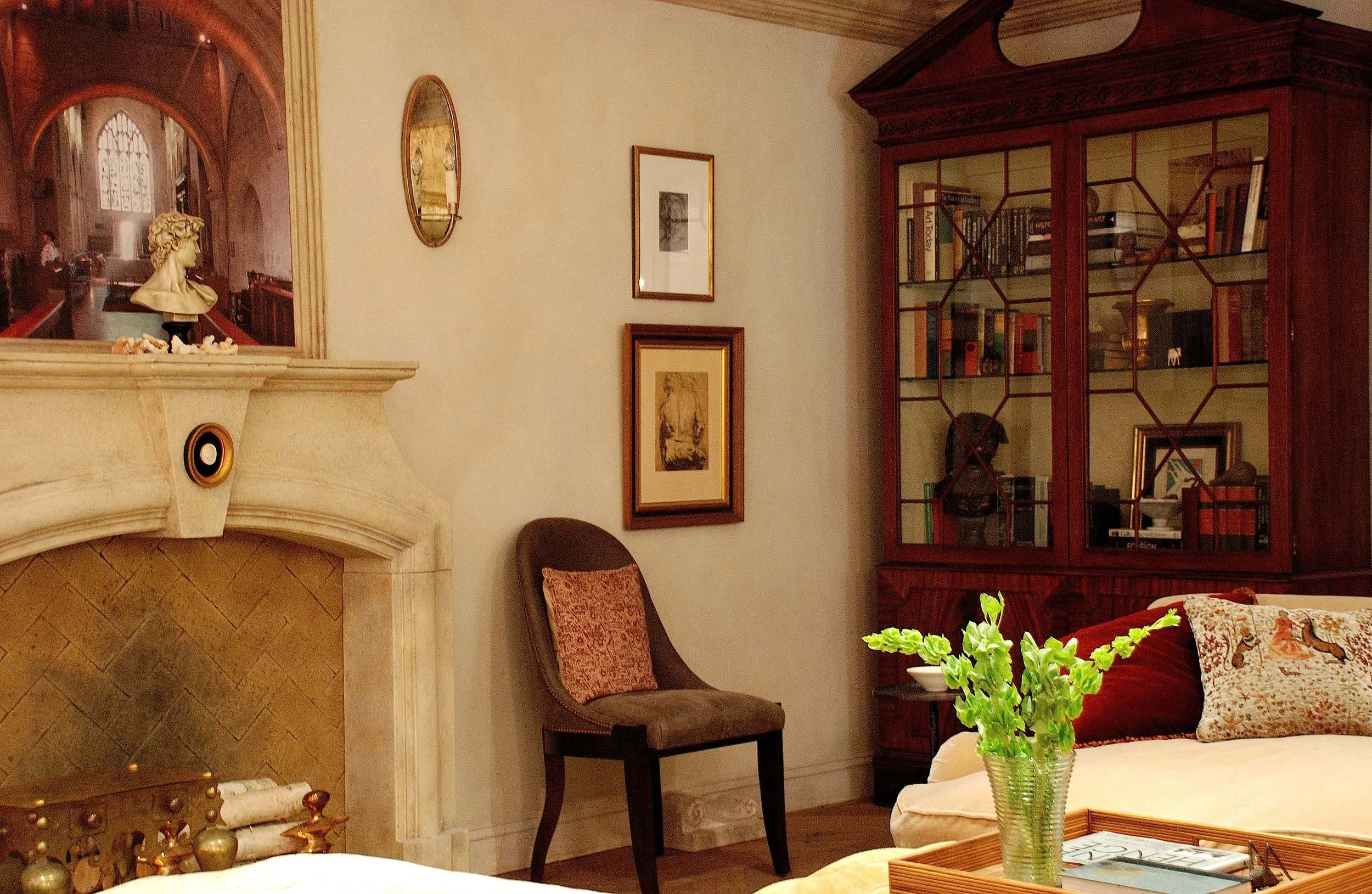
Design by Raji RM & Associates - A salon style display of art works
In How To Display Art: Part One I discussed the importance of negative space and scale. Today I'd like to focus more on the ways of hanging up your art work.
The Salon Style: It started in early 18th century Paris when the Beaux Arts Academy began exhibiting paintings of recent graduates from the École des Beaux Arts. As these annual exhibitions became popular, exhibiting at the Salon de Paris was one of the greatest honors an artist could have. At the Salon, paintings from various artists were hung from floor to ceiling on every inch of space. The salon was popular even then that artists painted the "salon" as the subject matter, particularly showing how the art was displayed. This style of hanging art is still in vogue, albeit in various simpler incarnations, that you can't read a single shelter publication without encountering a "salon style" art display.
As I mentioned in Part One, much of the appeal has got to do with the mass impact it creates covering large portions of the walls in lieu of using a single, very large painting. The way I like to do a salon style display is not by grouping works together for their likeness of subject matter or type or frame but by grouping those that are seemingly quite disparate yet hung as if they were parts of a larger painting that you are creating. For example, in the photo above there are two large modern art and a few vintage paintings, sketches and prints all grouped symmetrically and centered with a convex mirror. No particular connection to each other but the grouping has a sort of unexpected rhythm to it where the whole I think is more interesting than the parts.
Raji RM & Associates - Collage style display of art works
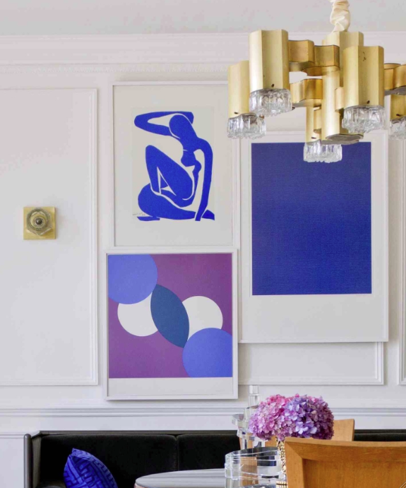
The Collage Style: Thinking once again along the lines of creating an assemblage using art works as parts of a greater whole, the collage style is nothing but a variation of the salon style. The difference being that you allow no gaps between the works thus leading the eye to the outer perimeter of the whole group which creates a larger whole. The collage style of displaying art works particularly well for a group of modern or contemporary art.
But these are not the only ways to display art. If you think like an artist or a curator, each setting, each art work can have a commanding and deserving presence. Acrylic cased collages made with a series of negatives by the mid-twentieth-century artist, Doug Prince deserved their own custom made steel brackets that protrude more than two feet from the wall. Set at an unobtrusive point on the wall where the light streams through from a nearby window, they beckon us to come close and marvel at the wonderful imagery they create. In the end, to me, it is about how much importance you want to give a piece of art in the grand scheme of things and how typically or atypically you chose to do it.
Art cannot be an after thought neither does it have to be a starting point to design a whole room. Rather they have to be chosen carefully and displayed thoughtfully in a way that enhances the room almost organically - as if it was always meant to be there.
- xo Raji

Raji RM & Associates - A set of collages made with a series of negatives deserved custom made steel brackets protruding 2 - 3 feet from the wall.