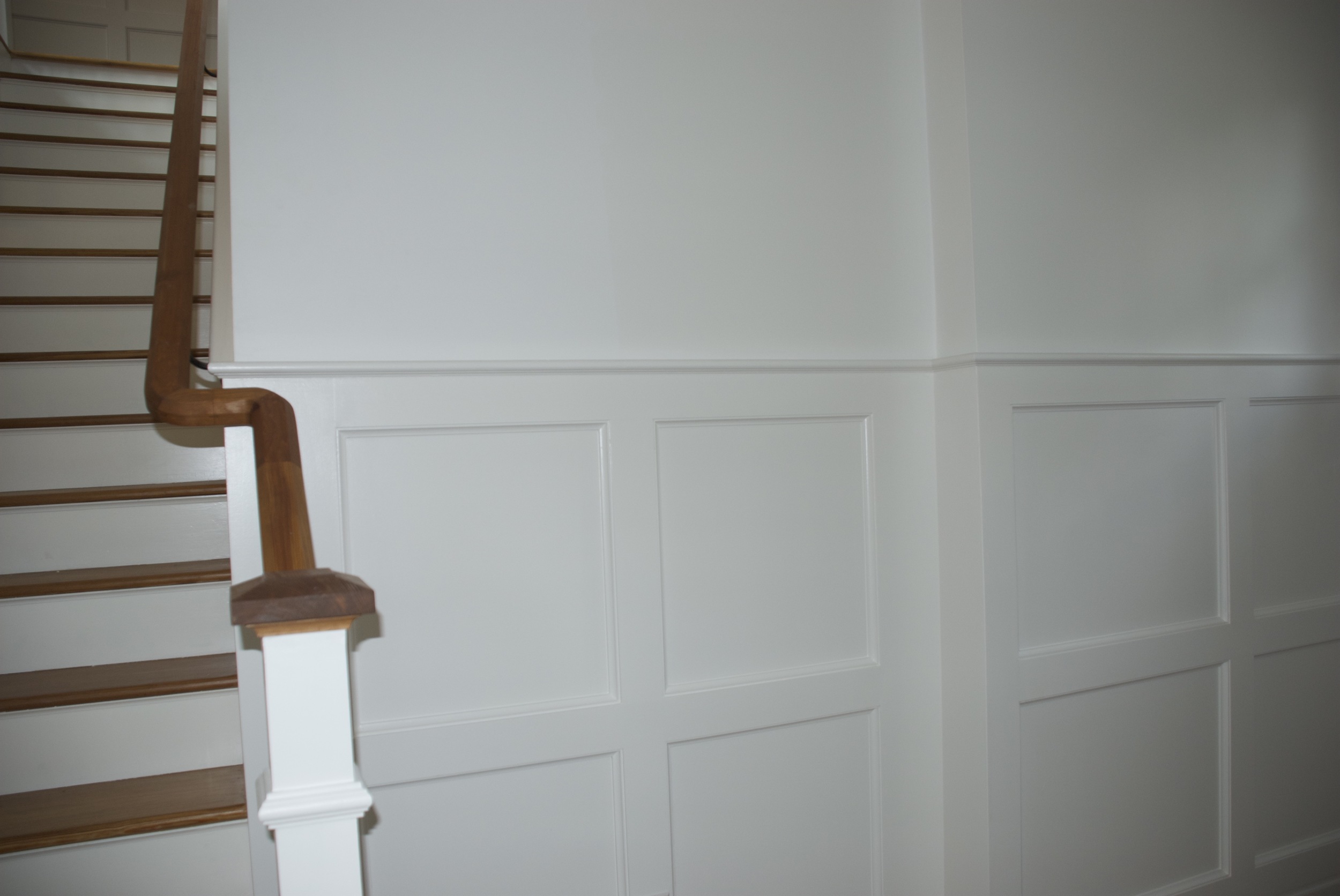
Raji RM Design - Work-in-progress during install
A few months ago I started on a project for a client whose daughter lives in New York and knew my work. When her mother bought an apartment in the lovely neighborhood of Kalorama in Washington DC, it was she who suggested to her mother that she call me. This is a contemporary apartment of a world traveler who has collected art over the years from around the globe. The client is a smart, sophisticated and caring person and I am very happy to have met her. Her apartment needed to suit her needs, her dreams. The goal was to create a sophisticated home with furnishings that worked well with the contemporary architecture and form a fine backdrop for her collection of global antiquities and modern art. For me, it was very important that the design & art meld and complement one another in a seamless fashion - one should pick up where the other left off. I also decided that because the art was significant and high in personality, the design needed to be fairly quiet and in keeping with the modern nature of the architecture. This meant that mixing traditional pieces with modern and contemporary furniture needed to be kept to a minimum.
In my own home (which is an amalgamation of Georgian and modern architecture) I have mixed a lot of contemporary, modern and traditional pieces together but I've always believed that the extent to which one can mix styles in furnishings has a lot to do with the architecture of the space and the inherent tastes or collections of the clients. This one is through and through a contemporary apartment. However, the client's collection of art ranges from modern art to 17th - 18th century Indian, Mexican, Japanese and Javanese sculptures. How do you bridge the gap? If I had added traditional furnishings it would not only be against the grain of the architecture but also very confusing and clashing with too many stories floating around. Thus, the key was to offer restraint and transition the antiquities gently into the modern world. Connect the dots, fill in for gaps in a sensible way. I thought of Christopher Columbus and I imagined taking a new route today starting in Asia, passing through Western Europe and eventually landing in America. The lynchpin being Western Europe, the missing part of the puzzle. As it happens the client expressed great interest in my murals. But I couldn't use just any mural. So the search began for European art that could work as a beautiful mural and backdrop for the antiquities while poised perfectly against the contemporary background. And it wasn't just the murals. The plan called for a slightly minimalist approach. That meant every piece of furniture had to have a reason for existence. Not just functionally but in the story I was weaving. French and Scandinavian modernist furnishings helped with that. Aesthetically, the design still needed some semblance of the old interpreted in a contemporary way and I couldn't think of better materials than brass and bronze which age beautifully and have that warm glow - this time in the form of modern tables and lamps.

Raji RM Design - Mural Installation


Raji RM Design - Work-in-progress during install
As we completed the installation, I thought of my client and imagined her family gathering around for the holidays, talking about their own stories and I smiled as I bid adieu to my team and hurried back home...
Wishing you and yours a Warm & Happy Holidays!
- xo Raji
p.s. photos of the completed project coming soon!
All photos via our Instagram posts.