#TBT: CharityWorks GreenHouse is a project Raji RM worked on in 2009 along with many other local designers. (This was originally posted in Design Dossier in September 2009 )
Initial rendering presented in early 2009 by Raji RM for the Foyer
I've often described interior architecture as akin to a great body especially before adorning a superb dress. If you fix the shell of a space as best you possibly can, what ever furnishings or decor you put in it is going to be even more amazing than when you first found it. While this seems quite logical and given, it's still not the first priority for so many. The instant gratification that many seek and evidenced by so much more willingness to rush and furnish spaces while understandable is exactly where restraint is lacking. Sure it takes time, a higher budget and a lot more patience to wait and get the floors, walls, ceiling and mill work just right. But the results are not only far better but also long lasting especially in keeping you happy knowing you have done all the right things. How long can you cover up with just make-up before your skin starts to show? But then, if you are really happy with your interior space, it's layout and the finishes you should certainly go ahead and get that instant gratification!
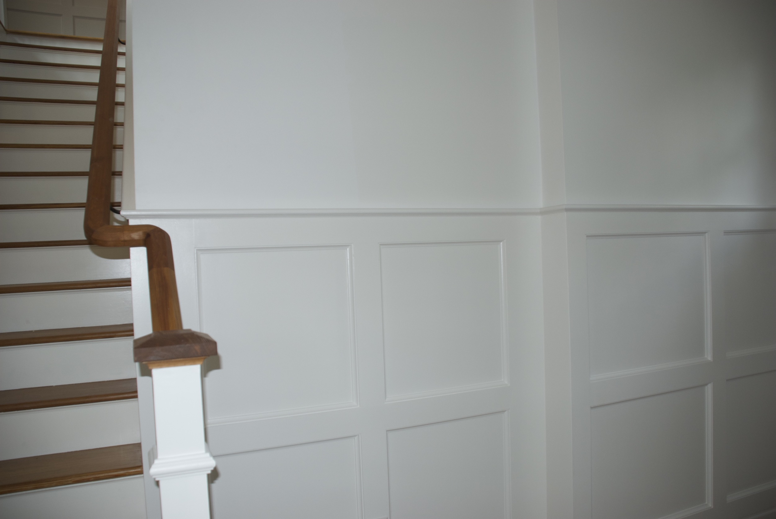
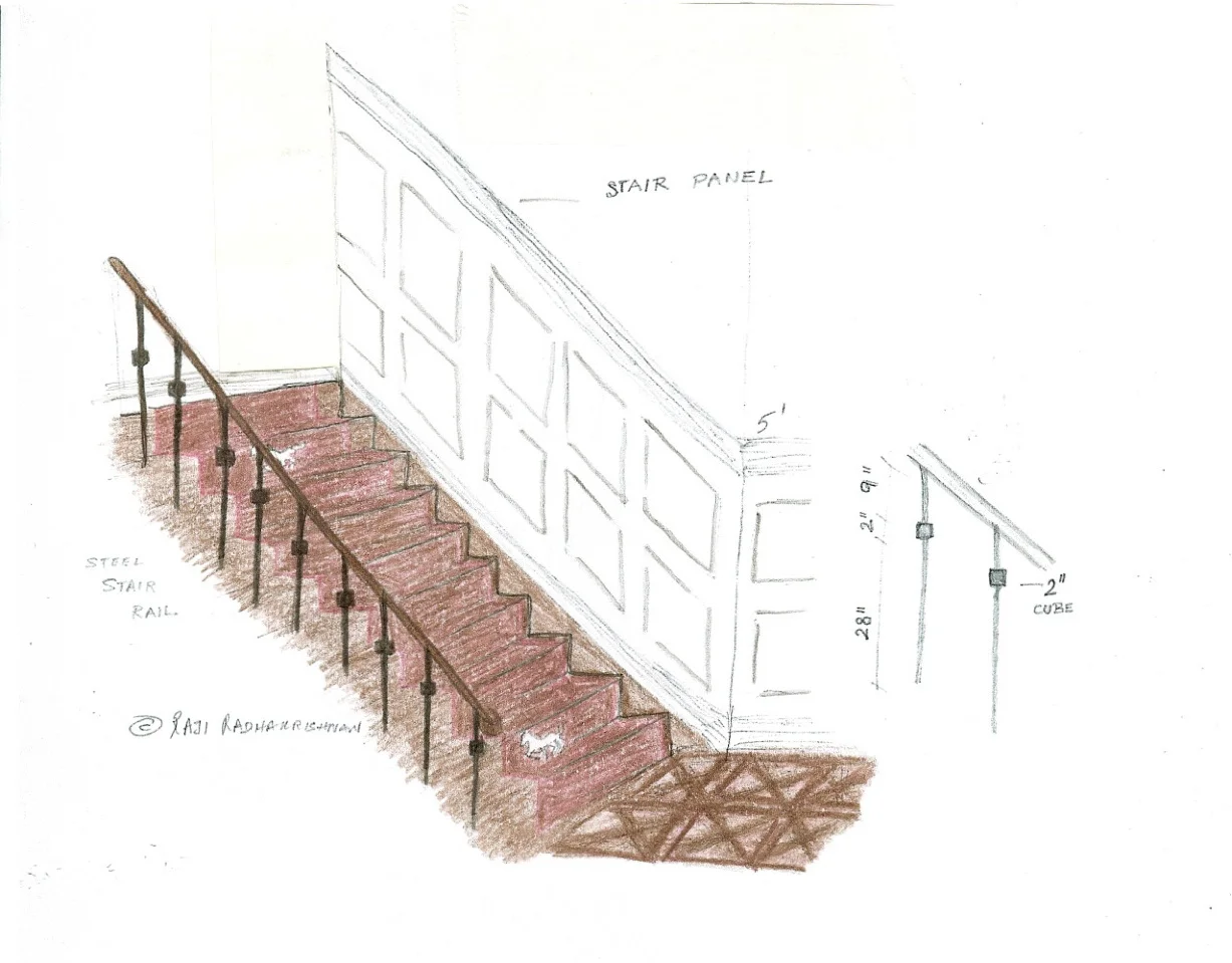
The new wainscot paneling Raji RM designed for the main entry
The house is a custom LEED certified green house thoughtfully built form scratch by the builder, Mark Turner of GreenSpur and beautifully designed by Cunningham Quill Architects. The interiors were left to be designed by the selected designers and the first time we were actually able to step into the house, the foyer and the hallways much like the rest of the interior were just plain dry walls. While I regard my spaces in the upcoming Charity Works Green House (the front porch, foyer, hallways, stairs and upstairs hall) as very important first impressions for the whole house, they are nevertheless a group of small, narrow meandering spaces. To make the best of it, the first thing I designed was a five feet high wainscot paneling (see photo above). This gives the narrow space some instant character not to mention some clear architectural heft. While the simple squares in the panel are a nod to the craftsman style of the house, at only five feet high from the ground keeps it from overwhelming the narrow spaces. Had I not added it, the entire onus of making the space would lie on the decor, but then again, there isn't much room for that either. And let me tell you, whatever few furnishings do finally end up in these spaces is by no means "just there". Think about all the factors that are going to count in the selection process -
- First and foremost it has to be very eco-friendly. That is the first criteria for everyone of the designers working in the house. Add to that my self-imposed green standard that it burns almost no fossil fuels, meaning use vintage, antiques or pre-owned as much as possible
- It has to fit the scale of the spaces yet be unobtrusive for the heavy traffic that will invariably be walking through these spaces back and forth
- Besides being luxurious and not bland or basic just because they are "eco-friendly", everything in my 'Foyer & Galleries' space has to be interesting and attractive enough to warrant a "pause and behold"
- At least a few good innovative ideas that can easily be parlayed by visitors in their own homes
- Has to be current for today's clients and their lifestyle yet in some ways at least agreeable to the craftsman architecture of the home without looking dated,
- And my own goals of keeping a good mix of things both traditional and modern in style to give the impression of things collected over a period of time through the different design eras the owners might have lived through and their own travels.
Go to charityworksgreenhouse.com for more information. A complete greenhouse inside out.
Stay tuned, next week we will show you all the after photos - fun, completed spaces!
Raji RM & Associates | Interior Designer & Decorator
Washington DC | New York
Contact us to learn more about our work