
Thanks to YAHOO! Canada and MSN.com for featuring our Louvre #1 mural in their article on how to redo walls!
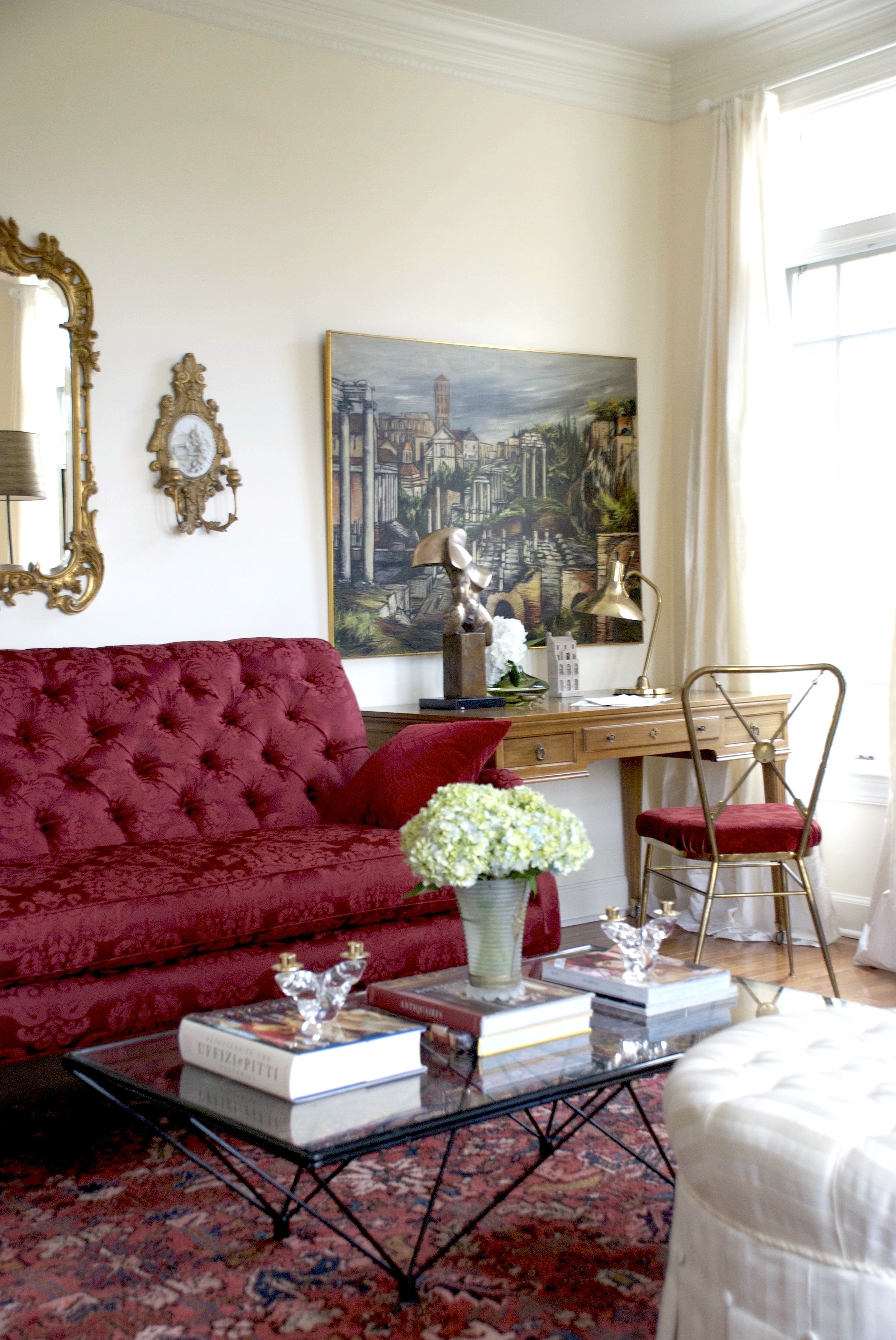
Master Bed Room designed by Raji RM featuring our Louvre #1 mural
Murals in Interiors
Thanks to YAHOO! Canada and MSN.com for featuring our Louvre #1 mural in their article on how to redo walls!

Master Bed Room designed by Raji RM featuring our Louvre #1 mural
Check out Domaine's fab post on panoramic murals and including our very own Louvre #1 mural in their feature story!

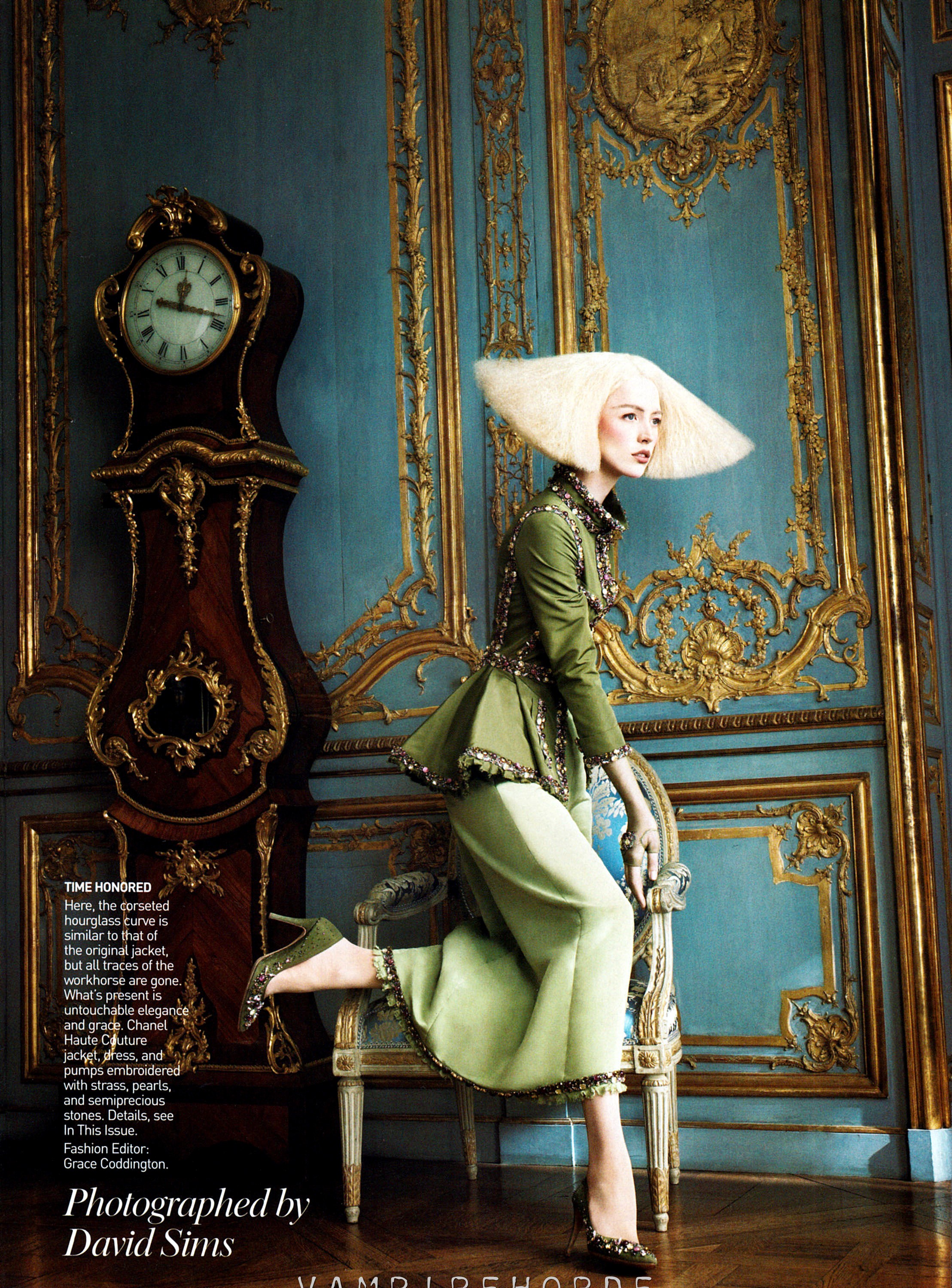
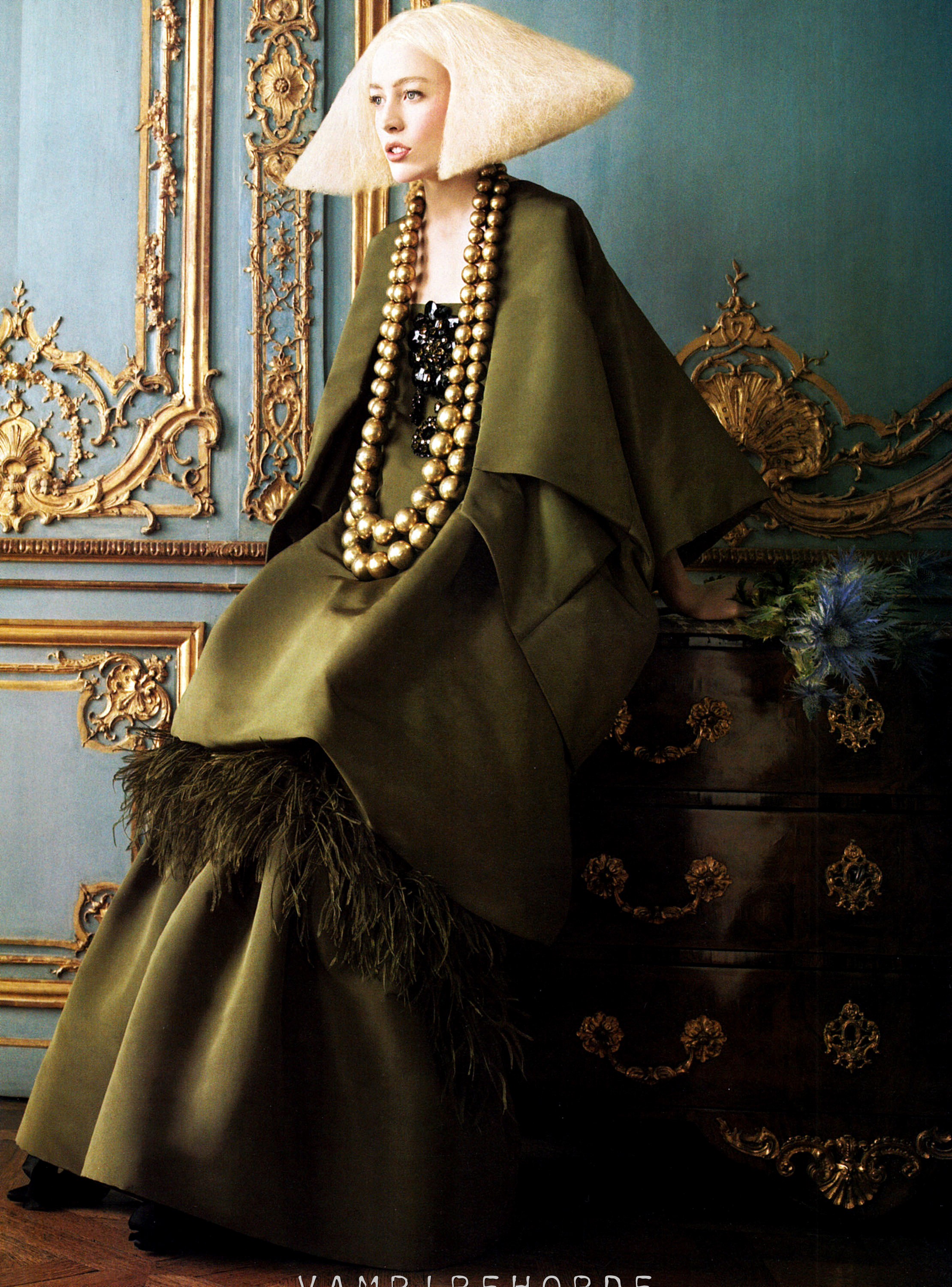
Isn't it amazing that in a day and age when we are all bombarded with images from Pinterest, Instagram, Facebook, Twitter and countless number of magazines, books, web sites and blogs, some images are just unforgettable?! They are so timeless that they stop you in your tracks again and again even years after they were originally shot. I was googling the other day searching for a Christian Lacroix bracelet I have and which needed some repairs. Browsing through images, I came across the first image below and it stopped me once again in my tracks as I fondly remembered the spread in the September 2007 issue of Vogue produced by Grace Coddington, shot by the uber talented photographer, David Sims and of course of the versatile Brazilian model, Raquel Zimmermann. Like for many, these images rocked my world for a long time and I still have these pages dogeared, tucked in my image screen, saved in my computer and on my phone.
Not even all of Vogue's spreads capture one's attention and hold it for years after like this spread did and still does! Everything about it - the rooms' setting, the model, the couture dresses, the hats, the hair, the make-up, the photography - the whole orchestration is magical. Being an interior designer of course, I noted the hand painted and gilded paneling and jib doors, the ormolu-like carved and gilded details of the architraves and it's variations in the blue room, the gorgeous and billowing curtain fabric with it's large floral medallions, a perfect complement to the walls and the Louis XIV & XV furnishings that are to die for!
So much so that these images influenced my design for a project I had loads of fun with! Particularly the first image where Raquel is wearing one of the most beautiful dresses by Christian Lacroix. The mulberry, plum and blueberry hues are shot through with the sharp velvet black hat, the fox sleeves and lacy chartreuse chiffon neck line all together poised in front of the complex creamy background. I loved it so much that I had to redraw the dress in the background of the room I created! The second image with John Galliano's champagne silk-taffeta embroidered with pearls jacket over a white tulle skirt for Christian Dior inspired another room I designed. Obviously they are not literal translations and aren't quite comparable. But, they are nevertheless inspired (and much more simplified) modern color stories I was happy to work with. And, I'm sure it's not the last time they will move me. As I say, il est tout ma tasse de thé!
Check back soon for Part 2 of this post - a step-by-step on how to design a room like a couture dress!


Interior Design by Raji RM & Associates

Image on left from Vogue and the Raji RM interior photo at right by Rikki Snyder

Interior Design by Raji RM & Associates


Raji RM & Associates | Interior Designer & Decorator
Washington DC | New York
Contact us to learn more about our work

A sampling of Raji RM Murals. Interior Design by Raji RM & Associates
We've had fantastic response for my murals since we launched the capsule collection this Spring and since many have asked what inspired me to start these murals, I thought I'd talk about how it all started #TBT. This is the story of I how I evolved my personal design aesthetic and particularly how my line of murals came to be. Rewind nearly a decade ago, I was in Versailles in the King's apartment wandering the rooms in awe and absolute love. I couldn't hear my husband's voice or the chattering of other visitors - it was just me and the rooms. I was lost in the architecture, the frescoes, the paintings - clicking away photos of painted ceilings, decorative cornices and velvet damask walls. They were all so gorgeous, I was speechless.
More flashback - My family and I had recently moved back to the east coast after a short stint in Palo Alto, CA where I was immersed and entranced with modern architecture, lofts, industrial design, et al. Not fully realizing how much I still loved classical architecture and design and like many design enthusiasts at that time, I was in a moment of flux about classical vs modern design. It was a time when some argued about the merits and demerits of using modern and contemporary furniture in a classically based setting vs. using very traditional furniture in a contemporary/modern setting. With all this churning in some corner of my head, there I was in the middle of what is arguably the most elaborate and vetted traditional architecture in history with high-ceiling frescoes and the most beautiful millwork in every corner and turn. The rooms in Versailles of course were full of gilded fauteuils, Louis XV bureau-plats, elaborate canapes, carved poster beds, etc. Most shoved to the walls behind velvet ropes to let the visitor traffic flow through without touching any of the furnishings. And there was a moment when, perplexed by the beauty in front of me and my still strong love of modernism and contemporary design, I paused letting other visitors push and walk right past me because I felt something very strongly. It was coming down but just not clear enough. As the last of the visitors left the room, I saw it. What if these rooms were filled with modern and contemporary furniture instead of the gilded fauteuils and beaureau-plats?
On my way to our hotel, I started to think and talk in great detail how I would design such a space. Take a grand, classical room and juxtapose it with modern and contemporary furnishings. Simple enough, right? Not so fast George Banks! In reality how will we create that grandeur? Versailles is Versailles! And that night I couldn't sleep not until I had an answer. Sure, it's not easy or one shouldn't even try to recreate rooms like in Versailles but couldn't we still evoke at least a simplified, modern version of it? Yes and No. You want to be very careful here. As the night progressed, frustrated and excited at the same time, I turned on my computer to connect my camera and upload the photos I took, hoping to jiggle my memory and recreate the feeling I had while in the King's apartment. And boy am I glad I did! The answer I was searching for was staring right in front of me in the photos I had taken that day. Not the photos of the rooms itself but the details I had captured in some of the frescoes in the ceilings, in the paintings on the walls. It struck me then, at least one way I can recreate the feeling of a grand space was to blow-up these digital photographs almost room size if needed. This would ideally create the classical backdrop I love, which will also be my cue to then decorate the room in more modern/contemporary (and traditional) style, letting the interplay between styles tell a new story - one that blends the past and the present, evoke thoughts of the best of history and modern life.

One of the first murals we created for a client in Chevy Chase, MD
Continuing our trip to England we came back home packed with goodies, mostly in my head and in my computer. I started toying with the ideas that kick started in Versailles but I don't think I even thought of it as murals just then. As luck would have it, soon after the trip Metropolitan Home magazine's Senior Design Editor, Linda O' Keefe called to ask if I would be interested in designing a show house room in Washington, DC. This was my first show house. I started planning the design in all earnest but not until I figured out how I was going to transfer the feeling I had in Versailles to the master bed room I was designing! As it turned out, it wasn't any of the photographs I took in Versailles that made the cut for this particular room but a photograph I took standing over a hundred feet below the front facade of the British Museum in London. More stars aligned as a brave client whose home I was designing in Chevy Chase, MD during that same time was also game for the idea of having one of her own photographs taken in Israel from the 70s digitally re-captured in detail by me for an entry way. By then I knew I was definitely on to something but making it a line didn't even occur to me until (fast forward) 2012 when I did the Kips Bay Show House. And the rest as they say is history.
Today, Raji RM murals still start with photographs I capture during my travels. Hundreds of them. Sorting through them I usually select just a few (3 to 4 may be) and start working on them to see if they could become a mural. I work on photography related applications that allow me to tweak the light, shadows, color, crop and remove the unwanted details, etc., just until it's perfect to become a mural. The photograph is then transferred to the lab (which I selected after trying several that didn't make the cut, including trying out different papers, finishes and thickness) to test samples of whole image and sections of the image, looking for color correctness, color bleeds, focus, panel cut points and overall to make a beautiful, large scale mural. Sometimes it doesn't work out and the images are terminated at this stage. The one image that does qualify is then printed into 2 - 4 panels that require installation by a professional wallpaper installer. The next image to become a mural only happens at a very inspired moment when I know I found something very special. For more on how to use these murals in today's interiors click here.
I hope you enjoy the murals as much as I do and let them transport you to a different time and place. To inspired moments! Cheers!
Raji Radhakrishnan
Raji RM & Associates | Interior Designer & Decorator
Washington DC | New York
Contact us to learn more about our work
You have probably guessed it by now - I have a thing for grand gestures. In fact, grand spaces as cavernous as they are and sometimes impractical and unnecessary, do create a very strong emotion in me. I think it's one of the reasons I absolutely love the great, big museums around the world. I've also learned that grand gestures in design are best appreciated when they go hand in hand with subtle and small gestures. In my work, very few realize the small design juxtapositions that create a rather large and meaningful impact in a very personal way. Never mind they don't always get noticed. They do the job quietly and beautifully. The large gestures certainly do get all the attention - like my murals. But, if I don't exercise the control to select the right space, the right subject, the right scale and colors and most importantly the very meaningful and small gestures that go with the larger ones - mind you they will cease to have the impact they usually do. And almost always it's the smaller, unnoticed gestures that clinch these larger than life designs making the room tell a story.
I can honestly say, I learned these inertia-ted subtleties of design by observing artists I adore. Particularly one - Thomas Struth. His Museum series of photographs enthrall me till date. Each a great story, each an exercise in grandeur and subtlety, the perfect complement of the big and the small. Of pride and humility. Of monumental scale and human proportions. Most importantly of dreams and reality and how they are so necessary to wisk one away to large fantasies only to come right back to the reality of how very small we really are in the grand scheme of things. And you guessed it...il est tout ma tasse de thé!
All Thomas Struth' photos via Tumblr & The New Yorker;

Leopold's #2 Mural from Raji RM murals collection. Juxtaposed on the adjacent wall is a tiny French wire sculpture propped on a shelf. Think David and Goliath! - Interior Design by Raji RM & Associates;
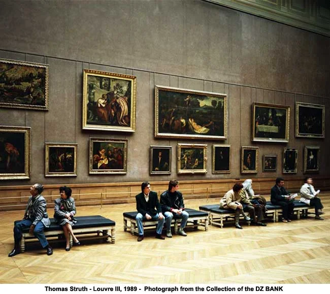
A most excellent article on this portrait by Thomas Struth and his work in The New Yorker
Raji RM & Associates | Interior Designer & Decorator
Washington DC | New York
Contact us to learn more about our work
We are thrilled to share with you our capsule collection of photo murals in the new page we have created to showcase them! As an interior designer, Raji believes that these murals give homes an extra jolt of visual interest. Their use and impact are varied and tremendous. At the very basic, they are no doubt beautiful art. Employed wisely in design projects, they can add architectural interest and indeed become focal points in a room, especially one that lacks any. And if handled masterfully, these murals can even turn the scale of a room on it's head! By selecting the right wall and the right mural you can actually manipulate one's perception about the size of the room. Contrary to popular belief that these large scale murals are best for rooms with serious square footage, they actually do more wonders when installed in a smaller, regular sized room. Take for example the room that Raji designed for the 2012 Kips Bay Show House. The actual room's dimensions were an awkward 10' x 12.5' x 13' 10 x 10' 11" with one wall entirely devoted to windows, another with a doorway and yet another wall indented and recessed partially. Raji chose to install two different wall murals - Kips Bay #4 & Versailles #5 on opposing walls. The larger mural, Kips Bay #4 not only helped solve the problem with the recessed wall but it made a fabulous focal point while tricking the eye in believing that the room was much larger and spacious than it actually was. This is not to undermine how incredibly useful these murals are to balance and tame the scale of large rooms too. Case in point - the Master Bed Room shown below which is over 18' wide x 26' deep.
Now that you know how these murals can help the design and decoration of a room, wouldn't it be very helpful to see these murals in action? You can now see each mural in our collection in more detail and view side-by-side an installation photograph showing how these murals can be used in a room! Raji has personally selected and worked on each mural. From the hundreds of photographs taken during her travels only a few make the cut to become a mural. This involves very carefully selecting the subjects that will bode well when blown up to a large format. Each mural is then subject to adjusting the colors, light and shadows and cropping them to the perfect size while editing the photograph to it's best and most complementing characters for an interior. Our new mural page showcasing the collection has taken out the guess work from knowing how the installed room can look. Each of these murals have been tried and tested in some of the country's most prestigious and high-traffic Designer Show Houses including New York's Kips Bay Sow House, the Hampton Designer Show House, and Washington DC's Designer Show House. Many are already installed in our client homes across the Washington DC area and in New York. Click here to view the collection and contact us to learn more about our collection of murals including dimensions, prices, etc.

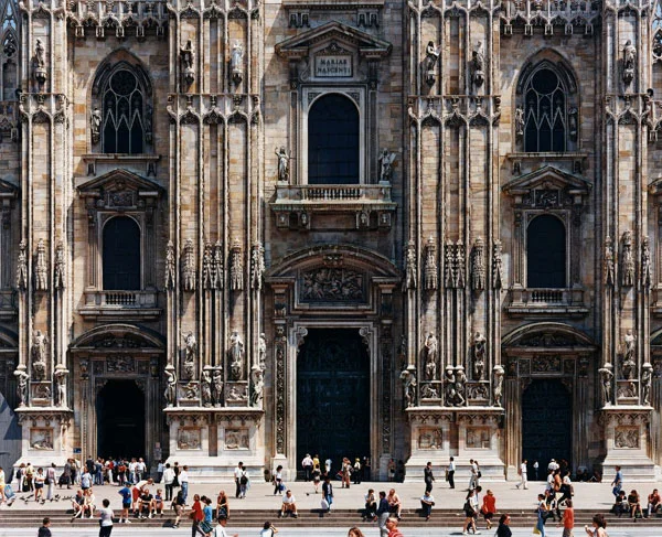
The Louvre #1

The Louvre #1 Installed in a master bed room designed by Raji RM & Associates
Raji RM & Associates | Interior Designer & Decorator
Washington DC | New York
Contact us to learn more about our work
It's no secret that I love all things French particularly the French Modern period between the 1920s - 1970s. Architecturally though, I'm more of a classicist. The juxtaposition of French Modern pieces against a classical background is a great complement to both these styles as you can see in my own home here. I am also a huge fan of English Architecture & Design. Sir Edwin Lutyens and Sir John Soane inspire me endlessly. And, English country I think is one of the most charmed way of living and it does not necessarily have to be grand. Take the Cotswolds - quiet streets lined with little cottages made of mud and centuries old stones, preserved, transporting you to a different period, a different era.
While visiting a new client a few years ago, Cotswolds was exactly what I was thinking about driving up the street lined with homes that looked like they came straight out of the pages of a story book. And, as I walked through the door, the character of the rooms simply confirmed my initial feeling. And I thought - il est tout ma tasse de thé!
Design by Raji RM & Associates
Design by Raji RM & Associates
Design by Raji RM & Associates
Design by Raji RM & Associates
For more project photos click here.
Raji RM & Associates | Interior Designer & Decorator
Washington DC | New York
Contact us to learn more about our work
Did you know you could special order any of the photo murals from our capsule collection? See below how California designer, Butch Valdez who ordered one of our photo murals used it in a project he designed! Check out the collection here - http://www.rajirm.com/murals/ #RajiRMInteriors #RajiRM #PhotoMurals #Art #Murals
Interior Design by Butch Valdez; Photo Mural from Raji RM
Interior Design by Butch Valdez; Photo Mural from Raji RM
Raji RM & Associates | Interior Designer & Decorator
Washington DC | New York
Contact us to learn more about our work