
Early #Mothersday #gift! ❤️❤️
Photo by Raji Radhakrishnan
Art
Early #Mothersday #gift! ❤️❤️
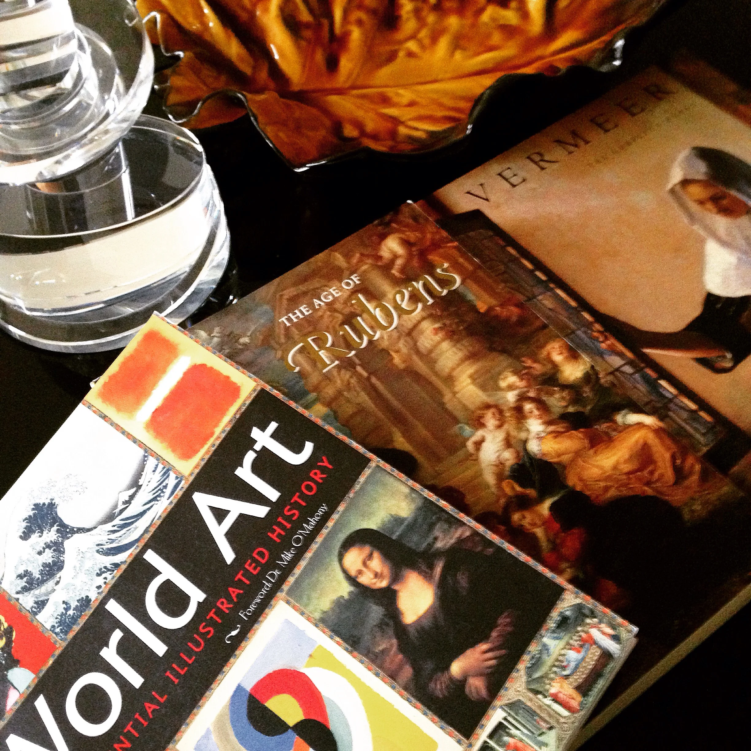
Photo by Raji Radhakrishnan
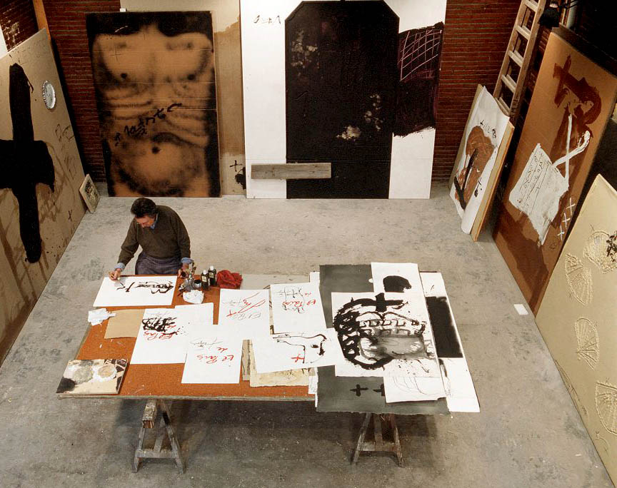
“The dramatic sufferings of adults and all the cruel fantasies of those of my own age, who seemed abandoned to their own impulses in the midst of so many catastrophes, appeared to inscribe themselves on the walls around me.." - Antoni Tapies
His works remind me of Cy Twombly. But it seems he was once influenced by Joan Miró and Paul Klee. Then he abandoned these influences to what became his signature style of work - "the heavily built-up surfaces that were often scratched, pitted and gouged and incised with letters, numbers and signs" - William Grimes, New York Times. The critic John Russell said it best and referred to his works that “seemed to have been not so much painted as excavated from an idiosyncratic compound of mud, sand, earth, dried blood and powdered minerals.”
Far from morbid and suffering thoughts (especially for a Monday morning) and as much as a happy person that I am, there is something about Tapies' work that draws me, captivates me and makes me want to discover more of him and his work. What can I say, other than, il est tout ma tasse de thé!

Antoni Tapies, 1923-2012


Images via NYTimes.com & Flickr
Have you checked out the fabulous blog Coco + Kelley lately? Read Cassandra's inspiring post on unique ways to hang art and see how Raji's work inspires her!
Read her post here
And if you haven't already, check out Raji's post on How To Display Art: Part One & Part Two!


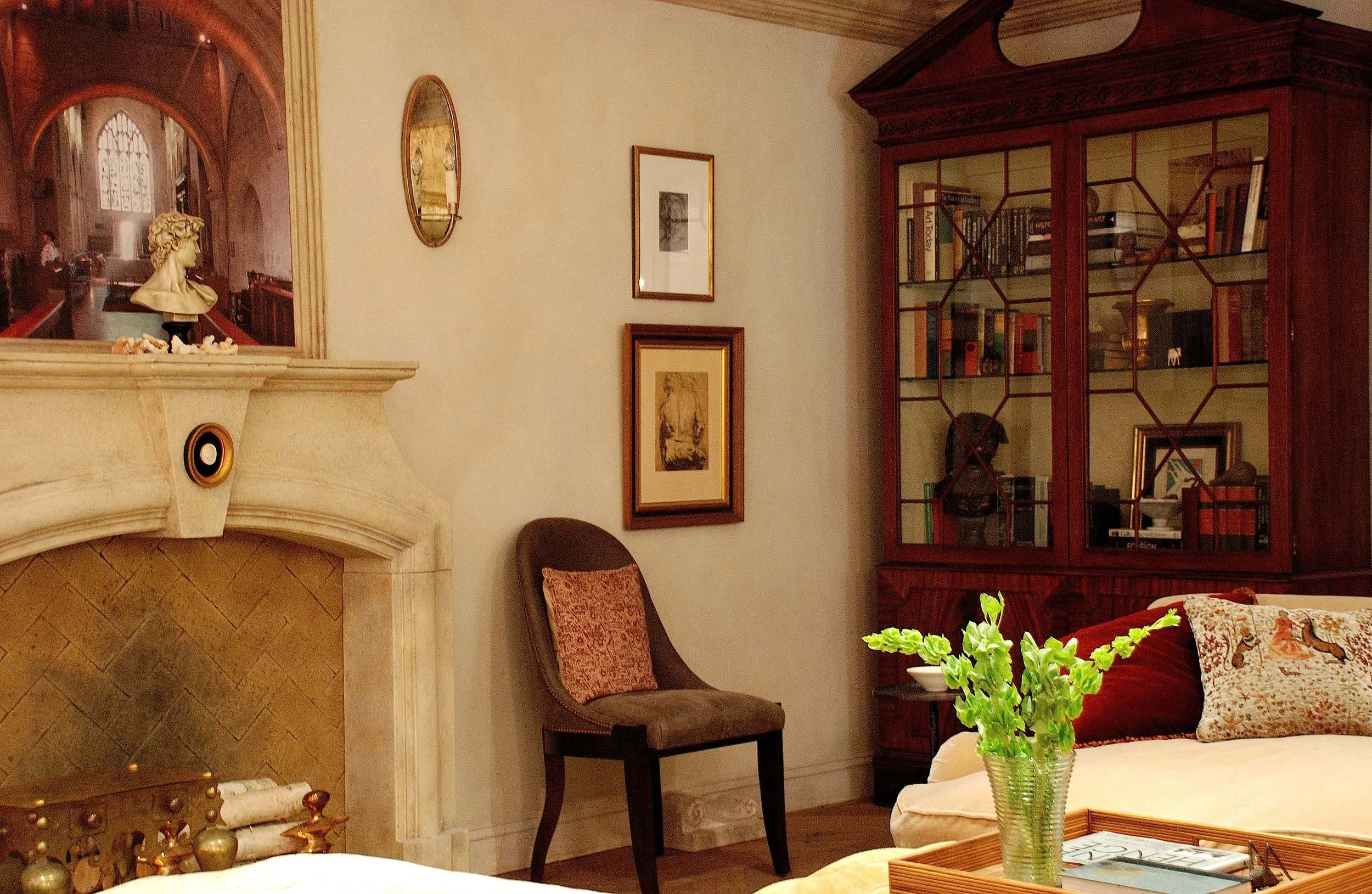
Design by Raji RM & Associates - A salon style display of art works
In How To Display Art: Part One I discussed the importance of negative space and scale. Today I'd like to focus more on the ways of hanging up your art work.
The Salon Style: It started in early 18th century Paris when the Beaux Arts Academy began exhibiting paintings of recent graduates from the École des Beaux Arts. As these annual exhibitions became popular, exhibiting at the Salon de Paris was one of the greatest honors an artist could have. At the Salon, paintings from various artists were hung from floor to ceiling on every inch of space. The salon was popular even then that artists painted the "salon" as the subject matter, particularly showing how the art was displayed. This style of hanging art is still in vogue, albeit in various simpler incarnations, that you can't read a single shelter publication without encountering a "salon style" art display.
As I mentioned in Part One, much of the appeal has got to do with the mass impact it creates covering large portions of the walls in lieu of using a single, very large painting. The way I like to do a salon style display is not by grouping works together for their likeness of subject matter or type or frame but by grouping those that are seemingly quite disparate yet hung as if they were parts of a larger painting that you are creating. For example, in the photo above there are two large modern art and a few vintage paintings, sketches and prints all grouped symmetrically and centered with a convex mirror. No particular connection to each other but the grouping has a sort of unexpected rhythm to it where the whole I think is more interesting than the parts.
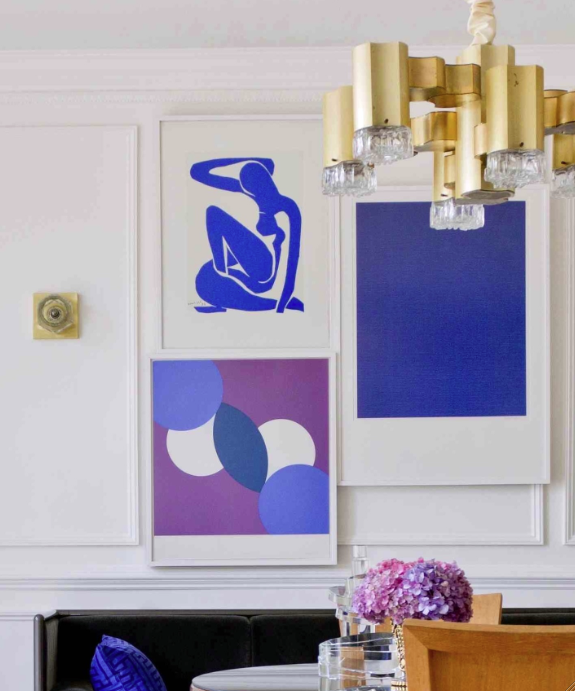
Raji RM & Associates - Collage style display of art works
The Collage Style: Thinking once again along the lines of creating an assemblage using art works as parts of a greater whole, the collage style is nothing but a variation of the salon style. The difference being that you allow no gaps between the works thus leading the eye to the outer perimeter of the whole group which creates a larger whole. The collage style of displaying art works particularly well for a group of modern or contemporary art.
But these are not the only ways to display art. If you think like an artist or a curator, each setting, each art work can have a commanding and deserving presence. Acrylic cased collages made with a series of negatives by the mid-twentieth-century artist, Doug Prince deserved their own custom made steel brackets that protrude more than two feet from the wall. Set at an unobtrusive point on the wall where the light streams through from a nearby window, they beckon us to come close and marvel at the wonderful imagery they create. In the end, to me, it is about how much importance you want to give a piece of art in the grand scheme of things and how typically or atypically you chose to do it.
Art cannot be an after thought neither does it have to be a starting point to design a whole room. Rather they have to be chosen carefully and displayed thoughtfully in a way that enhances the room almost organically - as if it was always meant to be there.
- xo Raji

Raji RM & Associates - A set of collages made with a series of negatives deserved custom made steel brackets protruding 2 - 3 feet from the wall.
Master Bed Room designed by Raji RM & Associates
It's no secret that I love art. It not only plays a major role in all my work, it in fact inspires me endlessly from a creative point of view. I can honestly say, I spend at least 5 - 10% of my awaken time studying or just looking at art because they really move me. Not every piece of art or every type for that matter. I do have certain types of works, certain artists I love much more than others but that is just my personal taste. At work, I often have projects where the clients already have a small or big collection of art that they love and cherish and it is always a definite influence when I design their homes. Not necessarily as a starting point for the whole design but I like to give a nod here and there. Sometimes, I help clients acquire new works of art. They are not always expensive but something that they will love.
When it comes to how to display your art works beautifully, the first thing I think about is how much negative space a wall and the room needs. This is very important. Not just in the display of the art, but to ensure what ever art you place integrates beautifully with the room's design plan too. This is of course assuming that most people in general want a fairly peaceful and balanced room as opposed to a chaotic or disorganized room. This means when I start designing a room, I'm certainly starting to think about possible best walls/areas/ways to display art. It's something to bear in the back of your mind while planning. In the design process, whether the clients already have art works they want to use or they will be acquiring new ones, installing the art work is almost the very last thing we do and it is only then that a room feels complete and alive.
After considering the negative space, next comes the all important scale. Beautiful art comes in all sizes, shapes and forms and regardless there is a way to display every kind to it's best advantage. Scale is about the relationship a work of art has to a wall and the room. Scale is also about knowing when to go proportionately larger and when to play with scale and do the unexpected. Large blank walls are great but not always needed. Challenges with very little wall space or walls of glass are always fun to deal with. It just means you think differently. Besides every art work is not meant to be on the wall. A wall of glass, for example, is primed to act as a beautiful and reflective backdrop for showcasing a great piece of sculpture. A group of art works displayed together, often referred to as salon style, can provide great scale and coverage to a room as much as a single large painting or a mural can. The effects are different though. An over-scaled painting or a large wall size mural tends to evoke a reaction that's in awe and the visitor is most likely to take a step back to realize the effect that large scale art has in the whole room. On the other hand, smaller works grouped together tend to coax the visitor to get closer and peer in at each little painting. There is a profound effect even in displaying a single and small work in a huge wall where say, 95 - 98% of the wall is empty. That little painting you love just got it's lime light, so make it a good one.
- xo Raji
In - Displaying Art: Part Two - we will discuss different display styles that will not only showcase your art beautifully but also act as a key design feature in a room.
A very nice interview with Karen Albert of Art by Karena. See how art drives Raji's design and her advice to young up and coming designers. Read the full interview here - http://artbykarena.blogspot.com/2014/07/raji-rm-associates.html

Raji Radhakrishnan, Raji RM & Associates; Photography by Abby Greenwalt