
#PatternOnPattern - fabrics mixed together and some #color thrown in for good measure! #TBT Detail of a room I designed at the 2011 Hamptons Designer Show House
- xo Raji
Design by Raji RM
Pattern
#PatternOnPattern - fabrics mixed together and some #color thrown in for good measure! #TBT Detail of a room I designed at the 2011 Hamptons Designer Show House
- xo Raji

Design by Raji RM
I think Domino called it Outfit to a Room?! When an outfit or an image of it arrests you so much that you can't forget it, it can very well translate to a room's design - just pick your battles. Not everything is for everybody. That means choosing outfits/images that you not only love but making sure the details are well within your reach or at least knowing how to make-do without some of that cache. In a previous post I shared photos of a September 2007 Vogue image which I loved so much and which inspired a room I designed. In this second part, I thought I'd share the details of how I actually went about designing the room. Let's break it down.

First off, the Christian Lacroix dress that Raquel Zimmerman wore is incredibly beautiful! The variety of colors, fabrics, textures and of course the cut and flow all had a role in it and so did the black hat. While the dress itself has a heavy influence from a Jane Austen like period fashion, the styling of Raquel's hair was much more contemporary with a very short, razor sharp cut and exaggerated volume. But you can still tell the Elizabethan influence there. I think the large black hat coupled with the hair style, cut through the period feel of the dress and brought it all down to earth, quite perfect for today. As if all this complexity was not enough, Grace Coddington ramped up the image's magic with the setting she chose - a very elaborate and detailed period room. So that puts the whole thing back to somewhere up there. I love the dress, but from a designer's point of you I love it way more in that particular setting. It makes all the difference (and more complicated!). So, of course, I took not just the dress but the whole photograph.

Left image from Vogue; Interior image on right by Raji RM & Associates
Now for a little background on the room I designed. Unlike the gorgeous room in the Vogue image with all the period detailing, the room I had to start with was rather contemporary in feel with tons of windows and a whole lot of sun light. I first decided that there was no fighting that. You go with the light, respect the architecture and in fact celebrate both. We don't live in the good ole' days of 18th Century France, so why try? The painted walls, medallion curtains and carved and gilded moldings was not going to happen either. That means, I have a prosaic white shell. Nowhere close to the setting in the inspiration image. But, that's OK. Because I can still sneak in some of the gilding and the painterly patterns in the furnishings.

Hickory Chair Sofa
Still, my first order of business was to introduce some of that warmth that you see in the Vogue image. Which, mind you, is also a reflection (captured by the photographer David Sims) of the light streaming by that window yet slightly shaded by the curtain. In cases like this it is that feeling you are trying to capture - that warmth. So, in came the large greenish beige sisal rug that instantly helped to warm up the room. Next came the large skirted sofa by Hickory Chair. This large beige sofa helped so much in two ways. First, the huge swath of beige fabric on the sofa again eased up all that white and brought in more of that much needed warmth but in a different tone from that of the rug. Second, the couture like detailing in the box pleated and buttoned skirt helped to bring some of that finesse and formality in the Vogue image but in a much more realistic and livable sort of way. Not to mention how it dueled a bit with the casual sisal rug. Layering of different tones, different styles and textures always helps.

Pair vintage Gio Ponti chairs from maison et toi
Next came everyone's favorite piece (and I think the couture equivalent) - the vintage Gio Ponti lounge chair. We upholstered the chair in a gorgeous pinkish plum velvet by Fabricut and paired it with a Rogers & Goffigon textured beige linen fabric for the sides. This contrast not only makes the chair interesting but gives the room that added layer of color contrast. But, it's the plum velvet and the lines of the chair that is the killer here. The modernity of the chair contrasts with the traditional style of the sofa beautifully. Now, bear in mind that when you translate an image of a dress into a room, you not only just take the colors but also the color proportions and the scale. Look at that Vogue image again. How much of the plum/pink in the dress occupies the whole image? About 25-30% may be? Then, that's all the plum that should be in the room too.

Raymond Subes Style Coffee Table from maison et toi
Now it's time for some gilding and pattern to appear. The coffee table I chose is vintage and very much in the manner of those that French designer, Raymond Subes designed in the 40s. It has a terrific design and is unbelievably heavy. The base is gilded iron with a wonderful scroll pattern which reminds you of all the carved and gilded panel moldings in the Vogue image but in a more modern kind of way. The top is an assemblage of mother-of-pearl, blocks of marble and poured resin. The gold, creams, browns and whites together with the materials in the table top add that first layer of pattern to the room. But, I felt the room needed a little more gilding and added the Giacometti lamp in the corner. The style of the lamp artfully injects more modernity to the space and I topped it off with a simple black conical paper shade much like the hat on Raquel! A sprinkling of the blueberry in her dress comes in the blue tones of the flower vase. Shades of maroon and brown on the pillows complement the dress further, and you start to see it coming together.

Giacometti Lamp from maison et toi
But, something was still amiss - we needed more pattern like the ones on the walls. True, pattern could have been introduced in those curtain fabric but like I said, that wasn't happening either. So where to introduce the pattern? The space needed extra seating anyway, so I found a pair of vintage bamboo stools in their original fabric - a floral patterned one in exactly the kind of color tones I was working with. Voila! That did it. Or so I thought. Dear lord, something was still amiss! That could be because the stools were actually quite small so the pattern on the fabric, while a real find, was not good enough scale-wise. At least not by itself. Remember how much pattern there is on the walls of that image? If I can't get the pattern on a wall full of windows by god I was going to create a mural! As a homage to the Vogue image but really on a whim, I painted a figure (on an old 4 x 8 mural) more like a silhouette with a semblance of the Lacroix dress. And I think that worked.
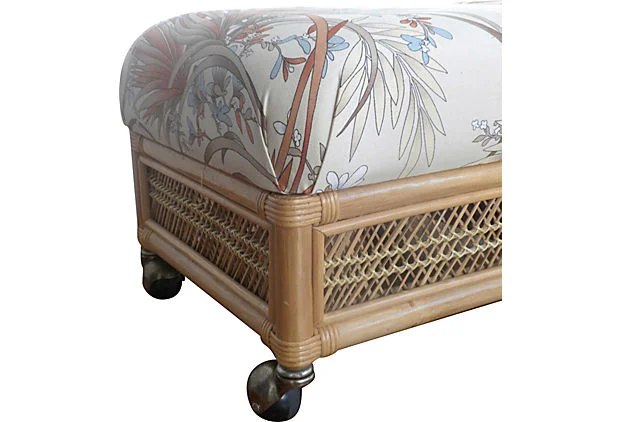
Vintage Rattan Stool from maison et toi
I know it isn't that simple. In fact, in reality designing any room inspired by Fashion or anything else is pretty complicated especially if you are fixated with an image like this. This is just a peak into how, as a designer, I get inspired and think through the process of designing. I hope you enjoyed it!
Raji RM & Associates | Interior Designer & Decorator
Washington DC | New York
Contact us to learn more about our work